
MDX in ReadMe
MDX combines the simplicity of Markdown with the power of JSX, allowing you to create rich, interactive documentation by integrating React components into your Markdown content. Learn more about MDX.
MDX Versus Markdown
Debugging MDXJust a quick reminder: the MDX format can be a bit strict, so you might encounter some compilation errors. If you run into any issues, feel free to use the MDX playground to troubleshoot them and ensure your syntax is on point.
MDX builds upon standard Markdown syntax, allowing you to seamlessly integrate JSX (JavaScript XML) into your content. Here's how MDX differs from regular Markdown:
Components
In MDX, you can use React components directly in your Markdown:
# My Heading

This is regular Markdown text.

<MyCustomComponent />

Back to Markdown again!
JavaScript Expressions
MDX allows you to use JavaScript expressions within curly braces:
# {frontmatter.title}

The current date is {new Date().toDateString()}
HTML and Markdown Interoperability
MDX allows you to freely mix HTML, JSX, and Markdown:
# Welcome

<div style={{ padding: '20px', backgroundColor: 'lightgrey' }}>
  This is a **Markdown** paragraph inside a <div>.
</div>
Remember, all standard Markdown syntax still works in MDX, so you can use it just like regular Markdown and gradually incorporate more advanced features as needed.
New MDX Components
We’re excited to introduce three powerful MDX components that you can start using right away in your documentation. These components are designed to enhance the structure and interactivity of your content, making it more engaging and user-friendly. Let's take a look at each of these components:
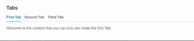
Tabs
Tabs allow you to organize content into separate, easily navigable sections:
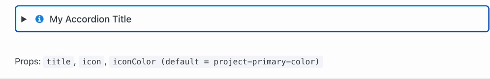
Accordion
Accordions help you present information in a collapsible format:
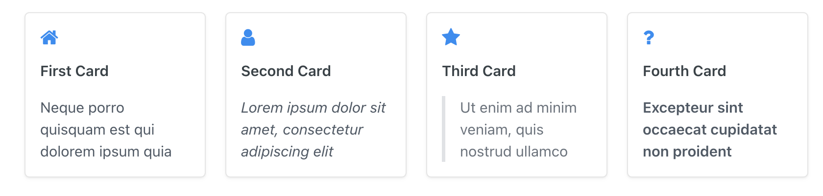
Cards
Cards allow you to display content in a grid-like structure:
Using Built-In Components
You can easily access our 3 built-in components by using the slash (/) command. Once you choose a component, the editor will automatically insert an editable example for you. In the example below, you can see how the Tabs component works.
Copying and Pasting JSX Components
When copying JSX from the documentation and pasting it into your own docs, make sure to paste it in raw mode. This ensures that the code will render as expected in production.
JSX Tabs
<Tabs>
 <Tab title="First Tab">
  Welcome to the content that you can only see inside the first Tab.
 </Tab>
 <Tab title="Second Tab">
  Here's content that's only inside the second Tab.
 </Tab>
 <Tab title="Third Tab">
  Here's content that's only inside the third Tab.
 </Tab>
</Tabs>
JSX Accordion
<Accordion title="My Accordion Title" icon="fa-info-circle" iconColor="#8470be">
  Lorem ipsum dolor sit amet, **consectetur adipiscing elit.** Ut enim
  ad minim veniam, quis nostrud exercitation ullamco. Excepteur sint
  occaecat cupidatat non proident!
</Accordion>
JSX Cards
<Cards columns={4}>
  <Card title="First Card" href="https://readme.com" icon="fa-home" target="_blank">
    Neque porro quisquam est qui dolorem ipsum quia
  </Card>
  <Card title="Second Card" icon="fa-user">
    *Lorem ipsum dolor sit amet, consectetur adipiscing elit*
  </Card>
  <Card title="Third Card" icon="fa-star">
    > Ut enim ad minim veniam, quis nostrud ullamco
  </Card>
  <Card title="Fourth Card" icon="fa-question">
    **Excepteur sint occaecat cupidatat non proident**
  </Card>
</Cards>
Changes to Glossary Terms
With the switch to MDX, the format for creating glossary terms has changed. Previously, you'd use double angle brackets to create a glossary term:
\<<glossary:term>>Now, with MDX, you'll use a <Glossary> component to create glossary terms:
<Glossary>term</Glossary>Future Release: Create Your Own Reusable MDX Components
In an upcoming release, we're excited to announce that you'll be able to create your own reusable MDX components:
- Custom Components: Design and implement components tailored to your specific documentation needs.
- Consistency: Ensure uniformity across your documentation by reusing your custom components.
- Efficiency: Save time by creating components for frequently used content structures or styles.
- Advanced Interactivity: Build complex, interactive elements that can be easily inserted into any MDX document.
Stay tuned for more information on this and other exciting features!
Migration Plan
We’re migrating content to MDX to select users without disrupting your ongoing projects.
FAQs
Q: Will my existing documentation be affected immediately?
A: Your current documentation will continue to work with traditional Markdown and MDX.
Q: Are there any prerequisites for switching to MDX?
A: Nope! MDX documents will be editable in a Markdown-like fashion by default.