Dark Mode for Enterprise
Dark Mode for Your Developer Hubs 🌛
Since your hub is available 24/7, developers can — and do — visit at all hours of the day and night. With Dark Mode, provide your developers with a reading experience that’s soothing on the eyes, no matter what time it is!
Enabling Dark Mode 😎
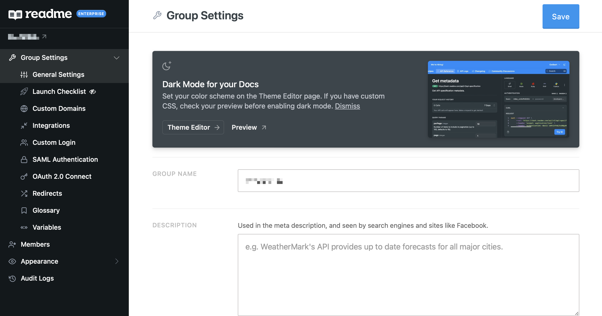
If you created your ReadMe Enterprise Group before January 24, 2023: you'll see a banner in your Enterprise Group dashboard where you can preview Dark Mode for your hub or click the link to go to the Theme Editor page in your Appearance section and finish configuring Dark Mode there. If you choose to dismiss the notification, your Group's default color scheme will remain as Light.
If you created your ReadMe account on or after January 24, 2023: your color scheme is set with Same as System as the default. If your Theme Editor page includes a section for Color Scheme, you can manually change the default scheme there.
Choosing a Default Color Scheme 🎨
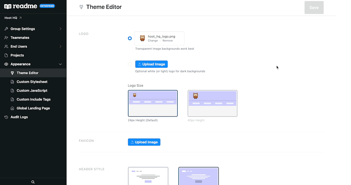
For Enterprise customers, the color scheme settings — Light, Dark, Same as System — are managed in your Enterprise Group dashboard, in the Theme Editor page, located within the Appearance section.
For Enterprise customers with multiple projects, the color scheme set in the Group dashboard applies to all related child projects.
We recommend selecting the Same as System option because it ensures that your hub will respect your developers' operating system preferences — light for light, and dark for dark.
If you have custom CSS, make sure to preview your hub before setting any color scheme changes live! You can find more detailed instructions below to ensure Dark Mode works with your custom CSS.
Preview Dark Mode on Any Page 💡
You can preview Dark Mode in any page of your developer hub by adding ?previewDarkMode=true to the end of any URL related to your developer hub!
Keep On Reading If:
- You have custom CSS for any of your projects, and:
- Your CSS changes text or background colors (or similar)
- Or your brand color or logo needs additional contrast on a dark theme
Just a note that your brand may require you to write enough custom CSS that you may want to stick with just one color scheme, and that’s okay!
CSS Selectors
There are two selectors you should use when targeting dark mode styles. The first applies when the color scheme is set to system and a user is not toggling dark or light modes.
@media (prefers-color-scheme: dark) {
  [data-color-mode="system"] YOUR_SELECTOR {
    /* CSS goes here */
  }
}
The second selector to use is for users who want to use Dark Mode, even when their system is set to light:
[data-color-mode="dark"] YOUR_SELECTOR {
  /* CSS goes here */
}
That’s it! You’ll need to use both selectors for everything to work. Here’s an example with everything together, to change the background color of the “Try It” button:
.App .rm-TryIt {
  --TryIt-background: yellow;
}

@media (prefers-color-scheme: dark) {
  [data-color-mode="system"] .App .rm-TryIt {
    --TryIt-background: purple;
  }
}

[data-color-mode="dark"] .App .rm-TryIt {
  --TryIt-background: purple;
}
Not seeing Dark Mode in your Enterprise Group?If you're not seeing the color scheme section in the Theme Editor page of your Enterprise Group—and thus unable to activate Dark Mode for your projects—it's most likely because you're not on the latest version of ReadMe's Global Landing Page.
Not to worry, our PXMs are here to help! Reach out to your PXM if you have any questions or if this sounds like the issue you're encountering 👍