Customizing Docs Using CSS Variables
Customization Options
There are two ways to customize your docs. We recommend using CSS variables; it's the easiest and safest way to add customization to your docs.
If you want to change your header background, you can set the CSS variable like so:
.App {
  --Header-background: #fff;
}
The other option is to write custom CSS. We'll expose global class names for you to use as selectors (prefixed with rm):
.rm-Header {
  background: #fff;
}
:root vs bodyOur CSS vars are targeted on the
:rootselector and load in after yours, so use thebodyselector to ensure your variables take priority!
Changing Your Typeface
You can change the typeface throughout your docs through the --font-family variable.
.App {
  --font-family: 'Your Typeface';
}
If you’re using a service like Google Fonts, you'll need to include the <link /> elements in your Custom HTML.
Header
Some variables vary depending on the primary color of your header background (set in the Appearance page, if it's dark or light). You can base your CSS variable overrides on light or dark by doing:
.ThemeContext_dark {
  --Header-button-color: #fff;
}
CSS Variables
| Name | Default Value | Description |
|---|---|---|
--Header-background | var(--color-primary) | --color-primary is your header background from the Appearance page of the dash. |
--Header-border-color | rgba(0, 0, 0, 0.1) | |
--Header-border-width | 1px | |
--Header-button-color | Color of button text in the header. | |
--Header-button-hover | Color of the button text when it's hovered over. | |
--Header-button-active | Color of of the button text when it is selected. | |
--Header-button-focus | ||
--Header-jumpTo-background | var(--color-primary-inverse) | |
--Header-jumpTo-color | var(--color-primary) | |
--Header-tab-padding | 5px 2px | Amount of padding within each navigation tab (available with the Line header option). |
--Header-tab-underline | var(--color-primary) | Color of the tab underline when using tabbed navigation (available with the Line header option). |
Global Classes

.rm-Header.rm-Logo.rm-Header-top-link.rm-Header-bottom-link.rm-SearchToggle.rm-Header-top-link_login
Not pictured:
.rm-JumpTo.rm-Logo-img
Sidebar
Global Classes

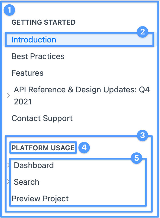
.rm-Sidebar.rm-Sidebar-link.rm-Sidebar-wrapper(wraps both heading and list).rm-Sidebar-heading(just the heading).rm-Sidebar-list(just the list)
CSS Variables
| Name | Default Value | Description |
|---|---|---|
--Sidebar-border-color | rgba(0, 0, 0, 0.1) | |
--Sidebar-indent | 15px | Indentation space of subpages |
--Sidebar-link-padding-y | 5px | Vertical padding of each item in the sidebar |
Table of Contents
The Table of Contents (ToC) appears on the right side of documentation pages and automatically tracks the reader's current position on the page. It is generated from the heading structure of your page content.
Global Classes
.rm-ToC— The top-level<nav>element for the Table of Contents. Use this to customize the ToC container, its links, and active state styling.
The ToC is hidden on viewports narrower than 1025px.
Article
Global Classes

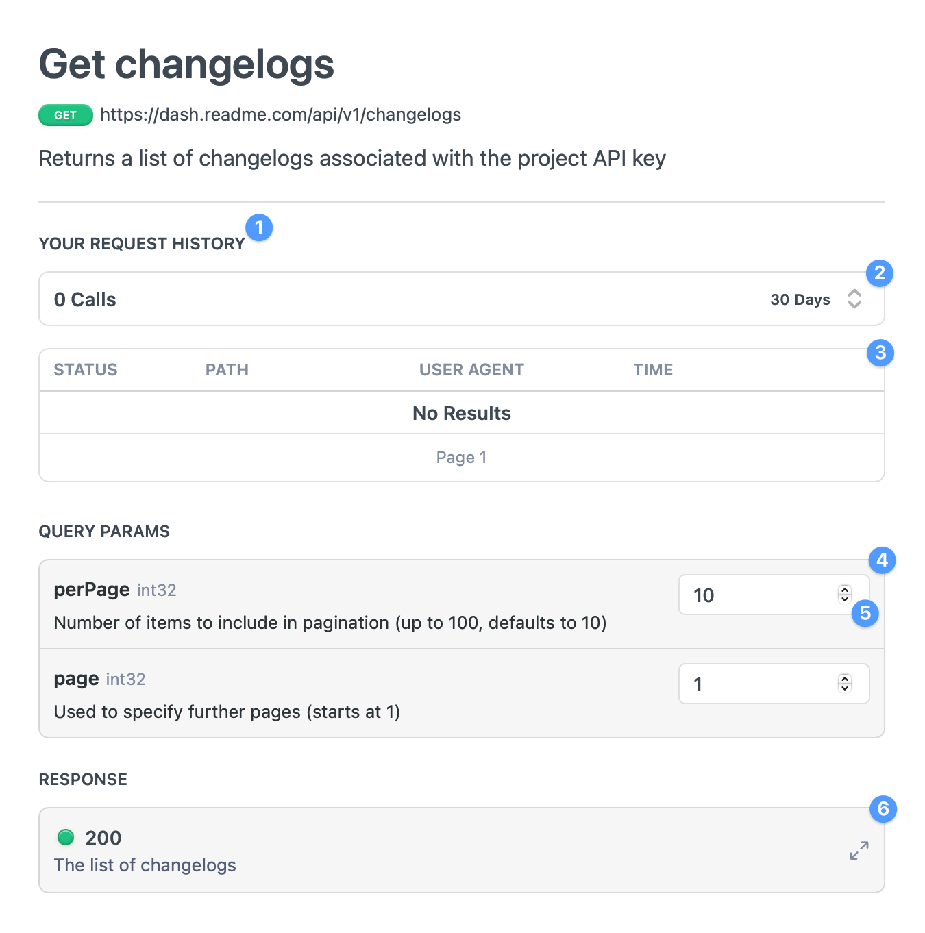
.rm-APISectionHeader(this selector is used in the Playground and will affect those too).rm-APILogInfo.rm-APILogsTable.rm-ParamContainer.rm-ParamInputor.rm-ParamSelect.rm-APIResponseSchemaPicker
Not pictured:
.rm-Pagination(the wrapper for the Previous / Next Page navigation buttons located at the bottom of page)
Playground
CSS Variables
| Name | Default Value | Description |
|---|---|---|
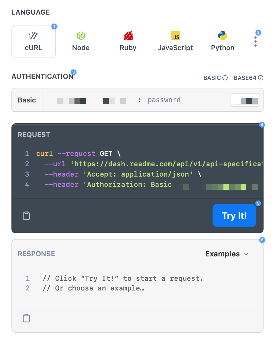
--tryit-background | var(--color-primary, #118cfd) | Background color of the Try It button. --color-primary is your header background from the Appearance page of the dash. |
--tryit-background-hover | var(--color-primary-darken-10, #0272d9) | |
--tryit-background-active | var(--color-primary-darken-20, #0158a7) | |
--tryit-background-focus | var(--color-primary-alpha-25, rgba(17,140,253,0.25)) | |
--tryit-background-disabled | var(--color-primary-darken-20, #0158a7) | |
--tryit-border-radius | var(--border-radius-lg) | --border-radius-lg defaults to 7.5px. |
--tryit-color | var(--color-primary-inverse) | |
--tryit-spinner-color | var(--color-primary-inverse) |
Global Classes

Language Picker:
.rm-LanguageButton.rm-LanguageButton-more.rm-APISectionHeader(this selector is used in the Article and will affect those too).rm-PlaygroundRequest.rm-TryIt.rm-PlaygroundResponse
Global Variables
| Name | Default Value |
|---|---|
--border-radius | 5px |
--border-radius-lg | calc(var(--border-radius) * 1.5) |
--box-shadow-menu-light | 0 5px 10px rgba(0,0,0,.05), 0 2px 6px rgba(0,0,0,.025), 0 1px 3px rgba(0,0,0,.025) |
--box-shadow-pill | inset 0 1px 1px 0 rgba(255,255,255,.2), inset 0 -1px 2px 0 rgba(0,0,0,.2), 0 1px 2px 0 rgba(0,0,0,0.05) |
--box-shadow-tooltip | 0 1px 2px rgba(0,0,0,.05), inset 0 -1px 2px rgba(0,0,0,.2), inset 0 1px 1px rgba(255,255,255,.2) |
--font-family | -apple-system, BlinkMacSystemFont, Segoe UI, Roboto, Oxygen, Ubuntu, Cantarell, Fira Sans, Droid Sans, Helvetica Neue, sans-serif |
--font-family-mono | "SF Mono", SFMono-Regular, ui-monospace, "DejaVu Sans Mono", Menlo, Consolas, monospace |
--font-weight | 500 |
--font-weight-bold | 600 |
--transition-fast | .15s |
--transition-slow | .3s |
--transition-timing | cubic-bezier(.16,1,.3,1) |
ReadMe Markdown
We also have several variables that are specific to ReadMe Markdown (RDMD), which is the Markdown engine that renders all of ReadMe's Markdown content. You can read about these variables and other tips for customizing RDMD.
Updated 29 days ago