MDX
Writing docs in ReadMe is done in Markdown eXtended (MDX), which is based on the CommonMark specification. Unlike pure Markdown, MDX uses a slightly different syntax called Javascript XML (JSX). There are some slight differences when writing MDX compared to Markdown if you’re attempting to write HTML.
Markdown vs MDX
All pages in ReadMe use MDX to offer you the ability to write reusable and interactive components. Generally, it shouldn’t make a difference when writing Markdown—unless you’re writing HTML. It looks like HTML, but is stricter. The most common issue is that you cannot have self-closing tags in JSX:
Invalid
<br>
<img>
<hr>
Valid
<br />
<img />
<hr />
All JSX-style tags must be explicitly closed, including self-closing tags.
Invalid
<p>Content
<ul>
  <li>1
  <li>2
  <li>3
</ul>
Valid
<p>Content</p>
<ul>
  <li>1</li>
  <li>2</li>
  <li>3</li>
</ul>
Most attributes will need to be camelCase—except data- and aria-. Inline styles will need to be an object {} and those properties also must be camelCase when written in JSX (does not apply if you’re writing CSS in a <style /> tag.
Invalid
<img
  aria-label="my label"
  class="my-class"
  style="
    margin-left: auto;
    margin-right: auto;
  "
>
Valid
<img
  aria-label="my label"
  className="my-class"
  style={{
    marginLeft: 'auto',
    marginRight: 'auto'
  }}
/>Tip: If you're running into other quirks or errors when working with MDX, check out Troubleshoot MDX Errors for more common issues.
Writing JSX

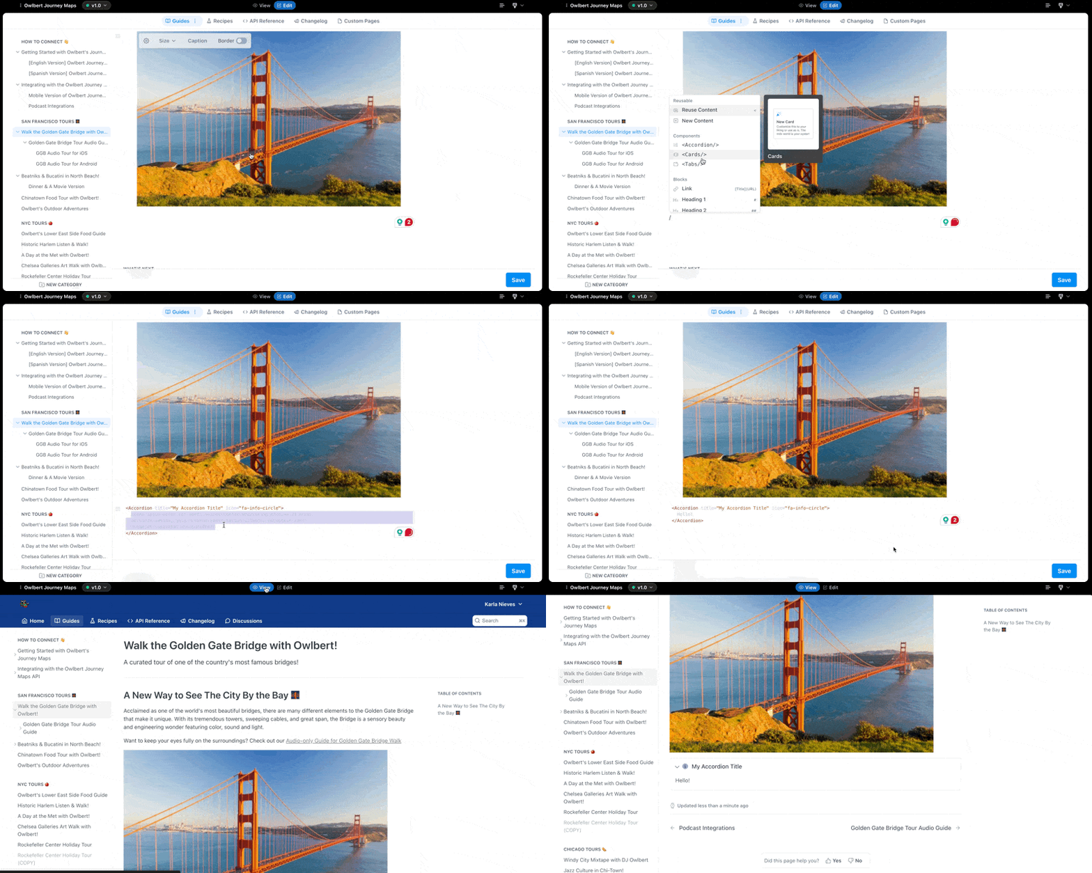
When editing your docs, you can write dynamic components in JSX, in a few ways:
-
On the page: Write your JSX in plain text. The editor will automatically parse your syntax and highlight your JSX.
-
Reusing Components: To write a component you can reuse in any page, open your Settings and navigate to the Custom Components page. Once you write your first component, you can reuse them on any page:
<ExampleComponent /> -
Out-of-the-box: Our editor makes it easy to use components we’ve built into ReadMe. You can find them by opening the command menu by typing
/in the editor. Under the Component section, you can choose theTabs,Accordion,Columns, orCardscomponents. -
Public Components: We also maintain a component marketplace where anyone can submit a component.
Updated 2 months ago