Dark Mode
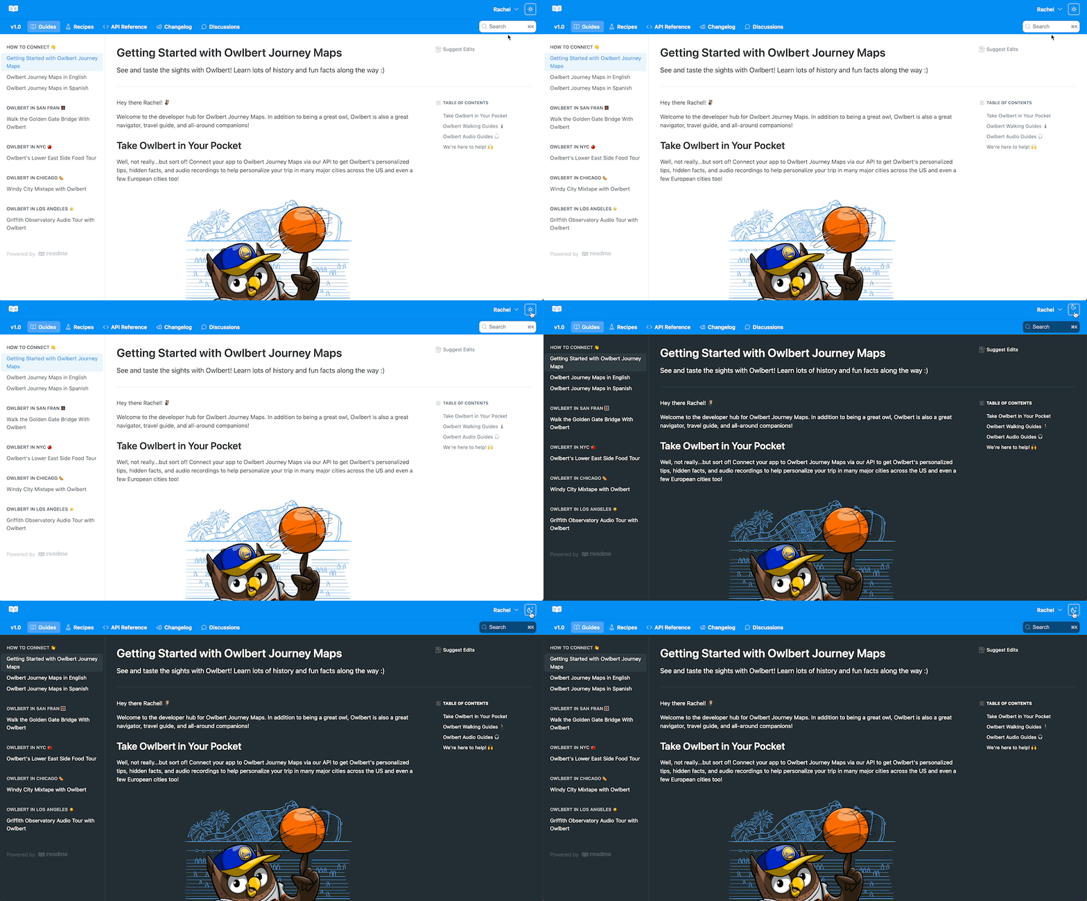
Since your hub is available 24/7, developers can — and do — visit at all hours of the day and night. With dark mode, provide your developers with a reading experience that’s soothing on the eyes, no matter what time it is!

Looking to Enable Dark Mode for your Enterprise Group?If you're a ReadMe Enterprise customer and want to enable Dark Mode for your Enterprise projects, you can find all the info on how to do so here in our Enterprise Guides
Theme
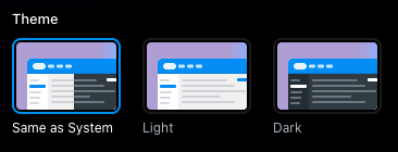
You can choose between 3 theme options: Same as System, Light, and Dark. You’ll be able to preview the layout before saving any changes.

If you use custom CSS, preview your hub to confirm your styles work correctly with the selected theme before saving changes.
Preview
Preview your changes directly in the settings page while you select a theme.
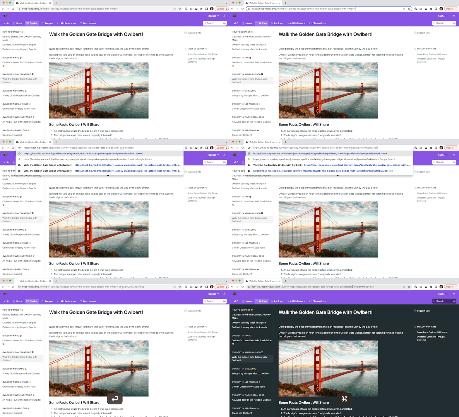
You can also preview Dark Mode on any page of your hub by adding ?previewDarkMode=true to the end of the page URL..

Keep On Reading If:
- You're on a plan that supports custom CSS, and:
- Your CSS changes text or background colors (or similar)
- Or your brand color or logo needs additional contrast on a dark theme
Just a note that your brand may require you to write enough custom CSS that you may want to stick with just one color scheme, and that’s okay!
CSS Selectors
There are two selectors you should use when targeting dark mode styles. The first applies when the color scheme is set to system and a user is not toggling dark or light modes.
@media (prefers-color-scheme: dark) {
  [data-color-mode="system"] YOUR_SELECTOR {
    /* CSS goes here */
  }
}
The second selector to use is for users who want to use dark mode, even when their system is set to light:
[data-color-mode="dark"] YOUR_SELECTOR {
  /* CSS goes here */
}
That’s it! You’ll need to use both selectors for everything to work. Here’s an example with everything together, to change the background color of the “Try It” button:
.App .rm-TryIt {
  --TryIt-background: yellow;
}

@media (prefers-color-scheme: dark) {
  [data-color-mode="system"] .App .rm-TryIt {
    --TryIt-background: purple;
  }
}

[data-color-mode="dark"] .App .rm-TryIt {
  --TryIt-background: purple;
}
Updated 2 months ago