
API & Docs Metrics Charts
Dig into the details of how your developers are using your API and docs with Metrics charts
Overview
So you've put in a lot of time and effort into building out beautiful documentation and an interactive developer hub for your API using ReadMe. Excellent!
Now it’s time to make sure that your developers are actually visiting your hub and taking advantage of all of the great information available to them. On top of that, you probably want to understand how your users interact with your API and use that combined knowledge to make your developer experience even better
With ReadMe’s API Metrics, you have reports on API call volume, endpoint usage, and errors that give you insights into your best use cases — and where developers might be getting stuck — at your fingertips. Plus, use the insights from your Doc Metrics to understand which guides are most popular, learn what terms and pages your devs are searching for most, and even dig into feedback on individual pages.
Accessing Documentation Metrics
To access documentation metrics
- Click on the Admin Settings from main navigation bar.
- Select Documentation Metrics from the menu.
What You Can Learn from Documentation Metrics
Here are a few questions to think about when looking at your Doc Metrics and API Metrics data — and how to look at them together to get even more powerful insights from your data:
How is my API growing and performing?
- API Calls + API Errors + Compare History
Who’s using my API?
- New Users: scroll down to view the feed + My Developers
- Biggest Users: API Calls, grouped by User Agent
What are my best API use cases?
- Top Endpoints (usage) + Page Views (what your developers are reading)
Are my docs getting users on the right track?
- Search + Page Views + Page Quality
- APIErrors over time
Using Metrics Charts
Within each page of your Metrics, you can dive further into the data using various filters and charts.
- History: tracking trends over time is a key way to measure the impact of improvements and new API features. Your ReadMe plan includes 24 hours worth of API request and Try It data, and you can add additional API logs in the Upgrade Plan page of your project dashboard to see even more history. you'll have access to a certain amount of data history. Toggle between time periods in the upper right corner to drill down on usage spikes, pull metrics over time for planning cycles, or see how much variability you have week to week.
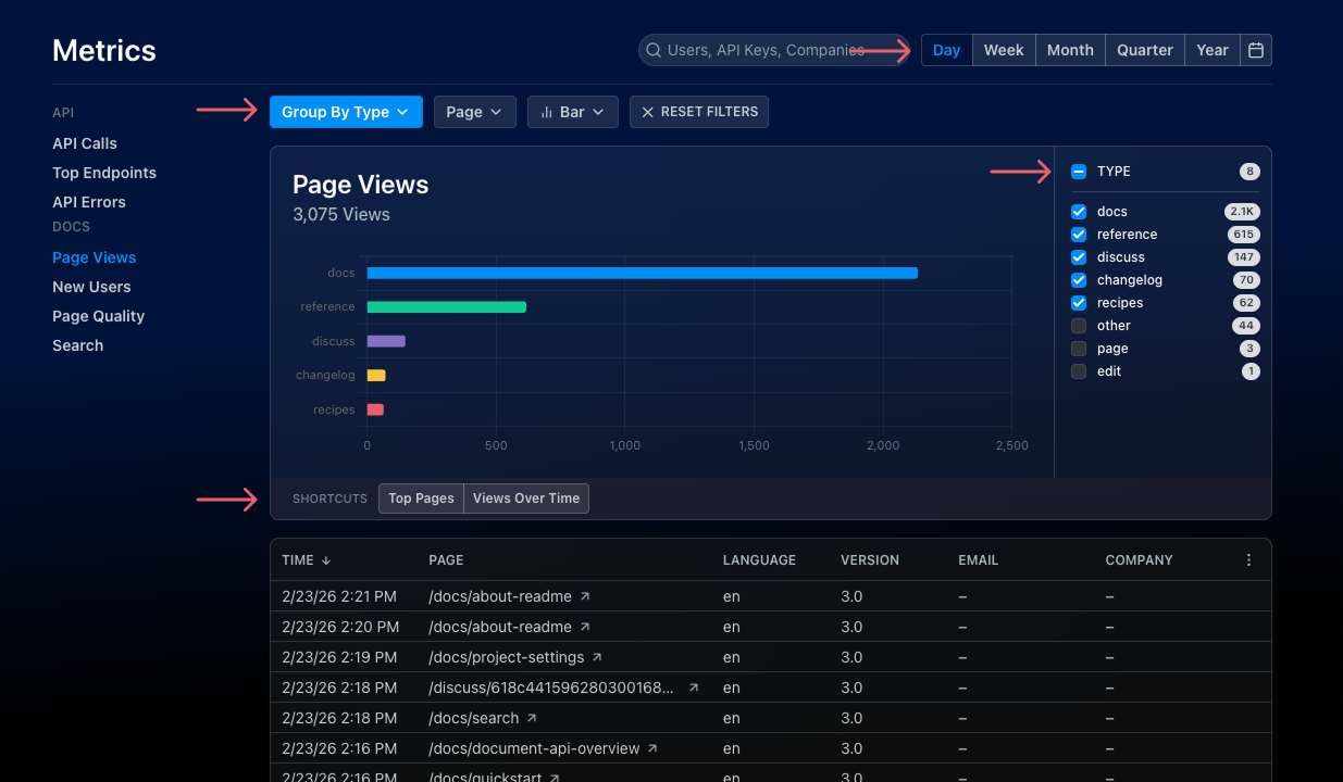
- Filters: dial into the answers you're looking for with filters specific to each chart to show, hide, or group the underlying data. These allow you to create custom views for the particular question you're investigating like breaking down API usage by method or tracking negative page votes over time. For Doc Metrics (Page Views, Page Quality, and Search), you can also use the Exclude domain filter to hide internal or teammate traffic by email domain (e.g.,
@company.com). - Chart Types: switch between line and bar charts to get the view of your data that's most helpful to you. Click the toggle to compare your data to the prior period (based on your chosen History window) to track trends over time.
- Shortcuts: think of these as ReadMe pro tips — we've put together one-click shortcuts to popular filter and history settings. Just check the bottom of each chart to see the pre-made shortcuts!
Understanding Your Doc Metrics
Have you ever wondered if users are finding what they need in your hub? Doc Metrics give you that visibility to inform your content strategy and make sure your hub is as useful as possible for your developers.
Your Docs Metrics include:
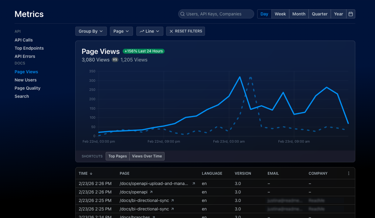
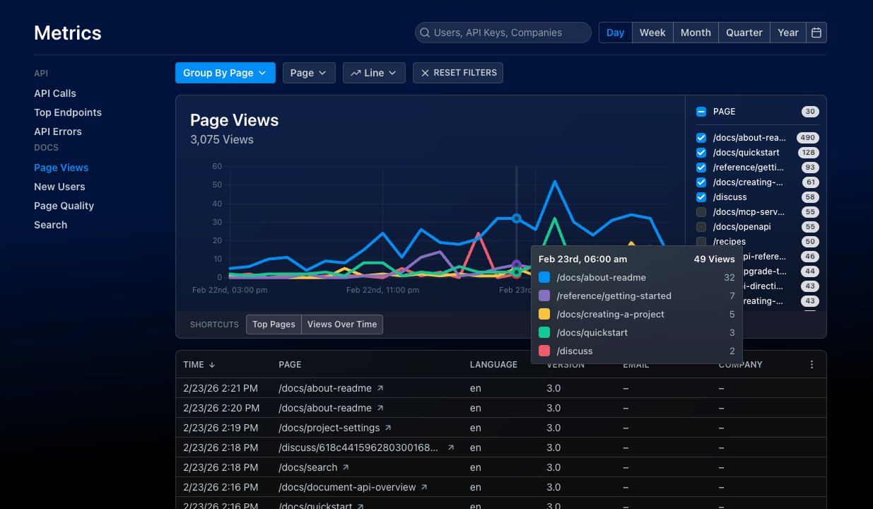
- Page Views: track usage of your hub over time, or Group By Path to identify your most popular pages. If you're curious if a page is being used (or if it's safe to sunset), use the Path dropdown to look up the metrics for that page specifically.
- Page Quality: page voting is one of the best ways to hear directly from your users with an in-the-moment thumbs up, thumbs down, or comment. Tracking this feedback over time helps you ensure your hub is actually useful to developers. You can enable or disable page voting directly from the Page Quality page in your Metrics section (click the gear icon dropdown ).
- Search: tracking common search terms is a great way to understand your users' mindset: what are they trying to do? What information are they having a hard time finding? Where are they getting stuck? In addition to tracking search volume over time, looking at your top search terms can help answer these questions. Just use the Top Search Terms shortcut for this chart!
Understanding Your MCP Metrics
If your project has an MCP server enabled and Developer Dashboard enabled, the MCP page in your Metrics section gives you visibility into how AI clients are using your MCP tools. You can find it under Docs in the Metrics sidebar.
The MCP metrics page includes:
- KPI Strip: at-a-glance stat cards for Tool Calls, Error Rate, Response Time (p95), and AI Clients, each with a per-day sparkline showing trends over the selected date range.
- Volume Graph: a per-tool line chart showing tool call volume over time, with an interactive legend for toggling individual tools.
- Filters: a free-text search input (matches path, spec, operation ID, slug, user agent, and query text) plus dropdown filters for Method, Status, Tool, and Spec File.
- Table: a detailed log of individual tool calls with columns for Time, Tool, Status, Method, Path, Operation ID, Response Time, Query, Results, Spec File, User Agent, and more. Use the column selector to show or hide forensic columns like Fingerprint, Client IP, and Trace ID.
Understanding Your API Metrics
Your API Metrics include:
- API Calls: measure total call volume to understand usage of your API. Use the Calls By Status shortcut to group calls by status code to see the breakdown of successful calls vs. errors over time.
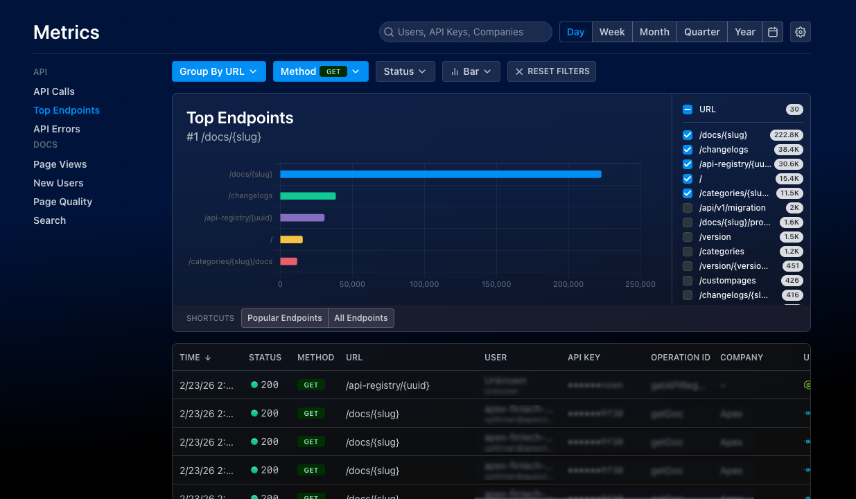
- Top Endpoints: get visibility into usage of each endpoint in your API, so you can easily see which endpoints are most (or least) popular with developers. This data helps you prioritize support and improvements for your most important endpoints or support deprecation decisions for ones that aren't being used.
- API Errors: see where your developers are running into trouble, and filter by endpoint or by status. Track errors over time, and spot an incident before it gets out of hand!
- New Users: keep track of active users of your API and see how that’s changing over time — a key metric for many API and Platform teams to track and report on internally. You can also quickly spot spikes (or drops) in usage that might indicate a problem or outage your team should investigate.
In addition to the rich insights you can unlock using My Developers, you can also use API Metrics to answer key questions about how people are using your API:
- Who are the heaviest users of your API?
- Which endpoints are most heavily used? Which endpoints are least popular?
- How are your error rates? Which endpoints are causing the most trouble?
You'll be able to apply these insights to make much more strategic decisions about your API. Here are a few examples:
- Unique API users: determine if new or existing customers are fueling API usage and how this changes over time
- Top API consumers: identify the top users and explore opportunities for upselling or endpoint improvements by observing how these power users interact with your API
- API pain points: isolate endpoints that are causing the most trouble and identify opportunities for improvement
Updated 28 days ago