
Custom Components
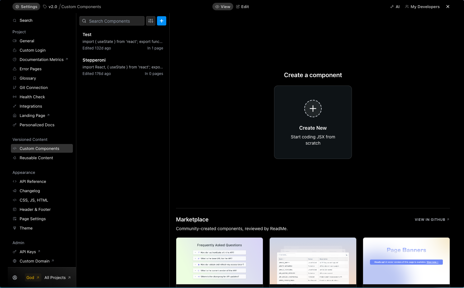
Create and manage custom MDX components from the Custom Components page in Settings. As you build, you’ll write JSX code and see a live preview of your component in real time. Once saved, you can access your components from the < menu and reuse them throughout your documentation.
Key Benefits
- Turn common patterns into reusable components to ensure consistency, simplify maintenance, and create a unified UI across your docs.
- Personalize content based on audience, use case, or access level without duplicating pages.
- Tailor components to fit your product and make your documentation stand out.
- Add interactivity to your docs with components that do more than just display content.
Marketplace
Browse the Marketplace to explore open-source components developed by the community. Each component is reviewed by ReadMe for quality and compliance. Simply select a component, make any necessary modifications, or use it as-is—then save it to begin integrating it into your documentation.
Feeling creative? Contribute your own! Open a pull request in the GitHub repo. Once merged, see your component live in the Marketplace and help grow the library for everyone.
Create Your First Component
Let's break down how to create a simple but useful custom component. We'll build a "Note" component that makes important information stand out in your docs.
export const ExampleComponent = props => {
  return (
    <div className="flex items-center h-full w-full">
      <div className="bg-gray-800 rounded-md p-6 m-4">
        {props.children}
      </div>
    </div>
  );
};

<ExampleComponent>
  Here's a very simple example component rather than an empty state. This should help you figure out what's happening quicker and see what's possible with custom components!
</ExampleComponent>
Understanding the Code
Line 1: export const ExampleComponent = props => {
- Here we're defining a new component called
ExampleComponent - The
exportkeyword is required to define any variable or component in MDX - We can access the React
propsto render any attributes or content added to the component tag
Lines 2-8: The component's structure
return (...)defines what the component will render when used- The outer
<div>uses Tailwind classes to center its content (flex items-center) and take up full width and height (h-full w-full) - The inner
<div>creates a dark gray box (bg-gray-800) with rounded corners (rounded-md) and spacing (p-6 m-4) {props.children}is the magic ingredient — it renders whatever content you place between your component tags
A Quick Note on Tailwind CSSDon't worry if these classes look unfamiliar! You can reference the official Tailwind CSS docs for a comprehensive guide on styling with utility clas
Lines 10-14: To render default component in preview and in your docs
- We require components to be added AFTER all exports to render the component in preview and use in the editor
- MDX syntax requires creating a newline before the preview component or an error will occur
<ExampleComponent>opens the component- The text between the tags becomes the
childrenprop </ExampleComponent>closes the component
This simple example creates a reusable styled container that you can use throughout your documentation. Just wrap any content with <ExampleComponent> tags, and it will appear in a nice dark gray box with proper spacing and rounded corners!
See the recipe below to walk through the code!
What makes this powerful? You can now use this component anywhere in your documentation where you need to highlight content in a consistent way. Need to change how highlighted content looks across your entire documentation? Just update the component once, and the changes apply everywhere you've used it!