Creating Mermaid Diagrams
Overview
Mermaid is a powerful diagramming tool that allows you to create various types of diagrams using text-based syntax. With our new Editing UI, you'll love how easy it is to add these diagrams to your docs. All it takes is a quick slash command, and you're ready to start creating flowcharts, sequence diagrams, and more!
Getting Started
To add a Mermaid diagram to your ReadMe documentation:
- Open the Editor UI in your documentation
- Type
/to bring up the slash commands - Select the Mermaid diagram block from the available options
- Enter your Mermaid syntax in the block
- The diagram will automatically render in your documentation
Example Flowchart
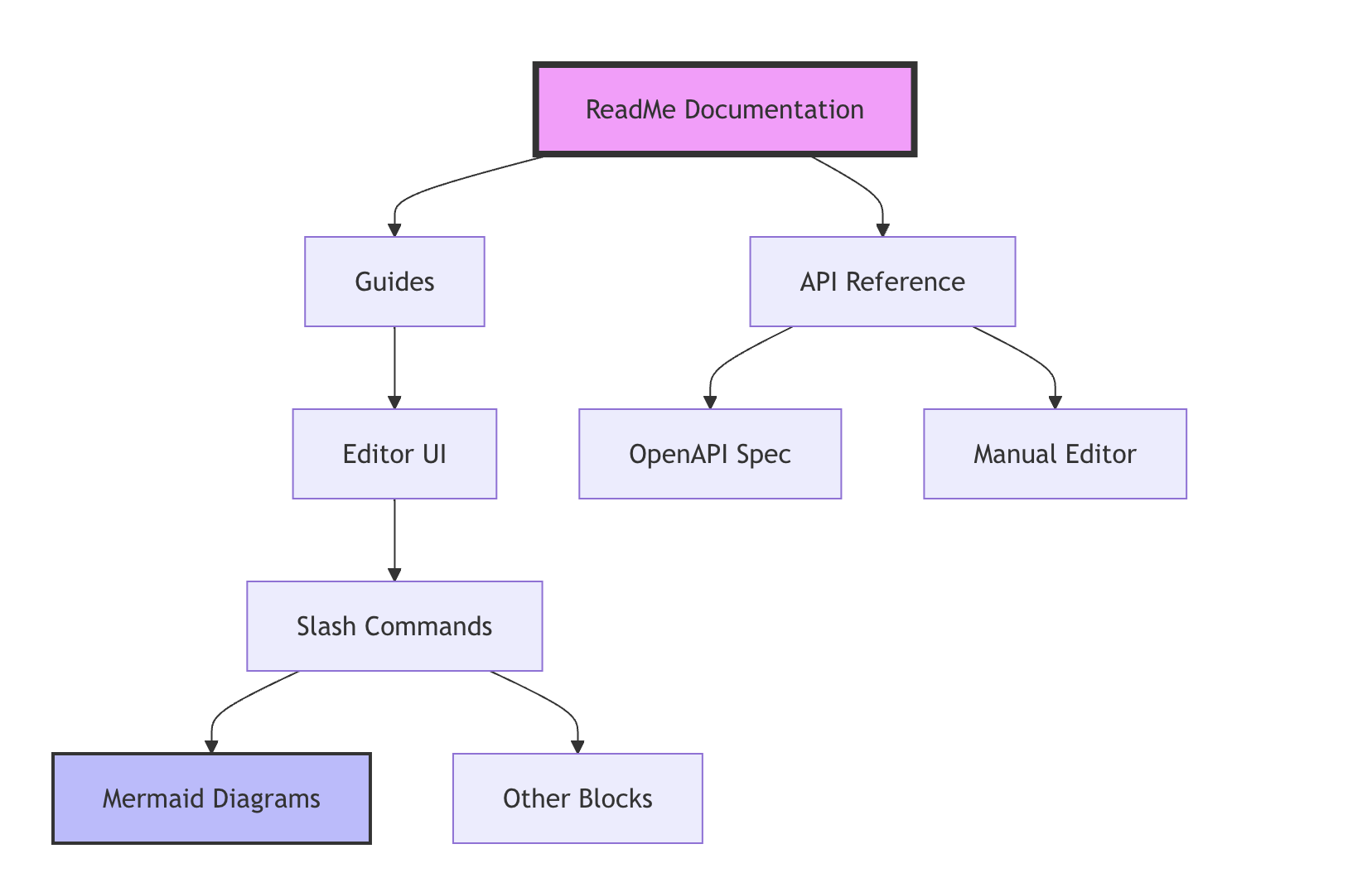
Let's create a flowchart showing our documentation features. Here's the complete code and explanation:
Example Code
flowchart TD
    ReadMe[ReadMe Documentation] --> Guides[Guides]
    ReadMe --> APIRef[API Reference]

    Guides --> Editor[Editor UI]
    Editor --> Slash[Slash Commands]
    Slash --> Mermaid[Mermaid Diagrams]
    Slash --> Other[Other Blocks]

    APIRef --> OpenAPI[OpenAPI Spec]
    APIRef --> Manual[Manual Editor]

    style ReadMe fill:#f9f,stroke:#333,stroke-width:4px
    style Mermaid fill:#bbf,stroke:#333,stroke-width:2px
Example Diagram

Code Breakdown
-
Diagram Declaration
flowchart TDflowchartdeclares we're creating a flowchartTDspecifies "Top Down" direction (the diagram flows from top to bottom)
-
Main Connections
ReadMe[ReadMe Documentation] --> Guides[Guides] ReadMe --> APIRef[API Reference]- Format:
NodeID[Display Text] --> OtherNodeID[Display Text] - Square brackets contain the text displayed in each box
- Arrows (
-->) create connections between nodes
- Format:
-
Building the Hierarchy
Guides --> Editor[Editor UI] Editor --> Slash[Slash Commands] Slash --> Mermaid[Mermaid Diagrams] Slash --> Other[Other Blocks] APIRef --> OpenAPI[OpenAPI Spec] APIRef --> Manual[Manual Editor]- Each line creates a new connection
- You can connect multiple nodes to the same parent
- The structure naturally creates a hierarchy
-
Styling Nodes
style ReadMe fill:#f9f,stroke:#333,stroke-width:4px
style Mermaid fill:#bbf,stroke:#333,stroke-width:2px
style NodeIDtargets specific nodes for stylingfillsets the background colorstrokesets the border colorstroke-widthsets the border thickness
Mermaid Syntax Guide
General Syntax Rules
-
Nodes and Shapes
[Square Boxes] (Round Edges) ([Stadium Shape]) [[Subroutine]] [(Database)] {Diamond} -
Connections
A --> B // Solid arrow A --- B // Solid line A -.-> B // Dotted arrow A ==> B // Thick arrow A -- text --> B // Arrow with text -
Direction Options
flowchart TB // Top to Bottom flowchart TD // Top Down (same as TB) flowchart BT // Bottom to Top flowchart LR // Left to Right flowchart RL // Right to Left -
Styling Elements
style NodeName fill:#color,stroke:#color,stroke-width:Npx,color:#text-color
linkStyle 0 stroke:#color,stroke-width:Npx
classDef className fill:#color,stroke:#color,stroke-width:Npx
Common Diagram Types
Mermaid supports various diagram types useful for documentation:
- Flowcharts (as shown above)
- Sequence diagrams
- State diagrams
- User Journey diagrams
- Gantt charts
Each type has its own syntax and best practices, but they all follow similar principles of clarity and simplicity.
Tips for Creating Effective Diagrams
When it comes to creating diagrams that your readers will love, think of yourself as a visual storyteller. Here are some friendly tips to help you craft diagrams that are both beautiful and effective:
Keep it Simple
Start with the basics! Begin with a simple structure and build from there. Similar to building with blocks – start with the foundation, then incorporate additional features as you need them. And keep those labels short and sweet!
Use Consistent Styling
Just like how your favorite apps have a consistent look and feel, your diagrams should too! Pick colors that make sense together (like using blue for inputs and green for successes), and stick with them. When something's super important, make it stand out.
Maintain Readability
Give your elements some space to breathe. If your diagram starts feeling crowded, consider splitting it into smaller, more focused diagrams. And don't forget to pick a direction that makes sense – sometimes top-to-bottom works best, other times left-to-right tells the story better.
Updated 2 months ago