
Themes
All plans have access to customize their in the Theme settings. Open Settings in the top-left of the admin UI, then select Theme in the sidebar.
- Layout
- Branding (Logo, Favicon, and Colors)
- Header style
- Typography (Spacing and Typeface)
| Starter | Pro | Enterprise |
|---|---|---|
Note: Additional customization options and services are available on Pro and Enterprise plans.
Layout
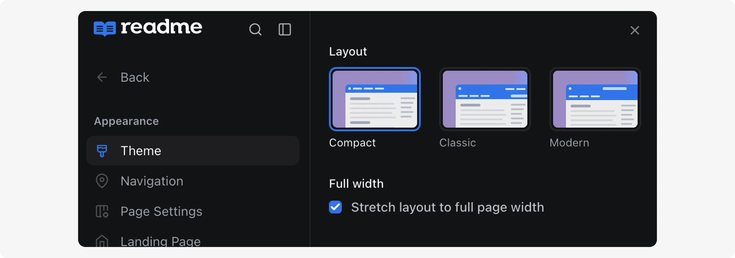
You can choose between 3 layout options: Classic, Compact, and Modern. And there’s also an option to stretch the layout for larger screens. You’ll be able to preview the layout before saving.
On the Page Settings page, you can also add breadcrumbs, collapse categories, hide the table of contents, and more.
Branding
Logo
An option to upload a white logo is available when an alternative is needed for certain themes and header color settings.
Format
- SVG is preferred for the best quality.
- If your logo is too complex for an SVG, WEBP is a good alternative—use 2x of your desired logo size for clarity in high-resolution displays.
- GIFs are not supported.
Dimensions
- 24px height by default. In the Classic and Modern themes you can select a larger 40px height logo.
Further Customization
- Customers with access to Custom CSS can use our global classes and css variables to tweak their logo display further:
.rm-Logo-img {
  --Header-logo-height: YOUR_CUSTOM_HEIGHT
}
Header
You can choose between 4 layout options: Line, Solid Color, Gradient, and Overlay.
The Line header option now defaults to a tab display for links. Users with the older button display can switch. Once you switch, you will not be able to switch back.
Further Customization
- Customers with access to Custom CSS can use our global classes and css variables to tweak their header further:
.rm-Header {
  --Header-background: YOUR_CUSTOM_VALUE /* defaults to your brand color */
  --Header-border-color: YOUR_CUSTOM_VALUE /* default: rgba(0, 0, 0, 0.1) */
  --Header-button-padding: YOUR_CUSTOM_VALUE /* default: 10px */

  /* Line theme only */
  --Header-tab-underline: YOUR_CUSTOM_VALUE /* defaults to your brand color */
}
Typography
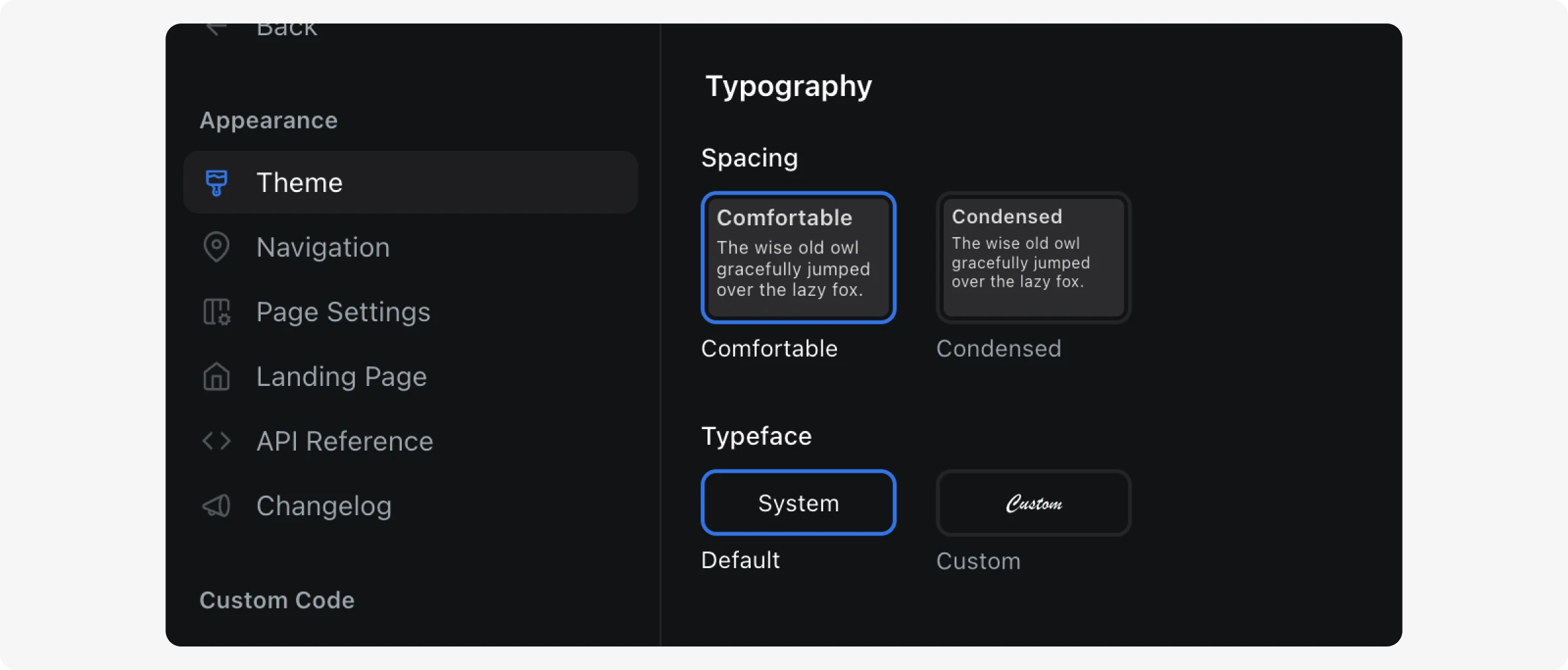
Spacing
Choose between two spacing modes that control font size, line height, reading width, and overall content density:
| Setting | Description |
|---|---|
| Comfortable | Larger base font size (16px), wider heading scale, and a narrower reading width (~90 characters) for a more spacious feel. This is the default for all projects. |
| Condensed | Smaller base font size (15px), tighter heading scale, and a wider reading width (~110 characters) for a more compact layout. |
Typeface
You can choose between the default system typeface or select custom fonts for your docs. When selecting Custom, you can independently configure:
| Font Slot | Description |
|---|---|
| Headings | Font used for all heading elements (h1–h6). |
| Body & UI | Font used for body text and UI elements. |
| Code | Font used for inline code and code blocks. |
Custom fonts can be selected from Google Fonts, or customers on plans that support custom stylesheets can upload their own font files.
Updated last month